Directors’ Institute Finland
Directors’ Institute Finland (DIF) helps their members with expertise, education and networking. Their aim is to contribute to the development of the professional capabilities of its members, and thus enhance its position as a leader in the national debate on corporate governance.
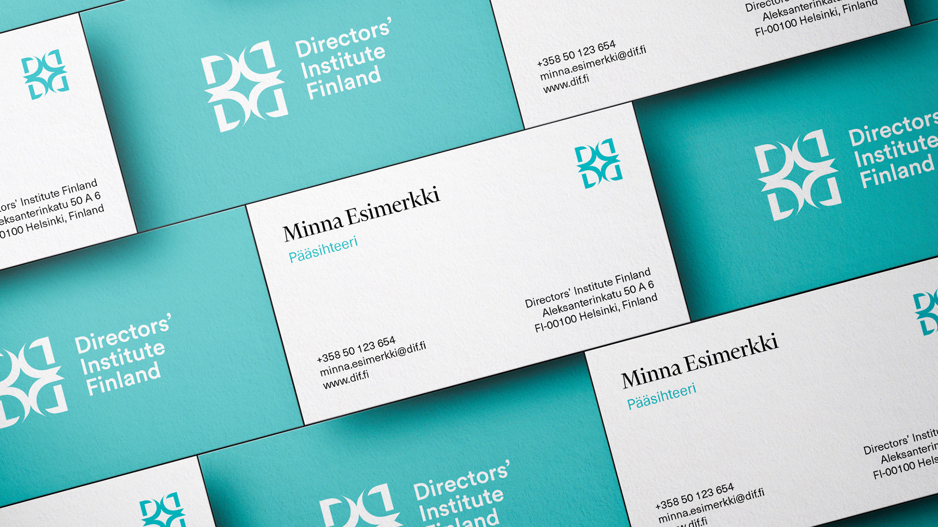
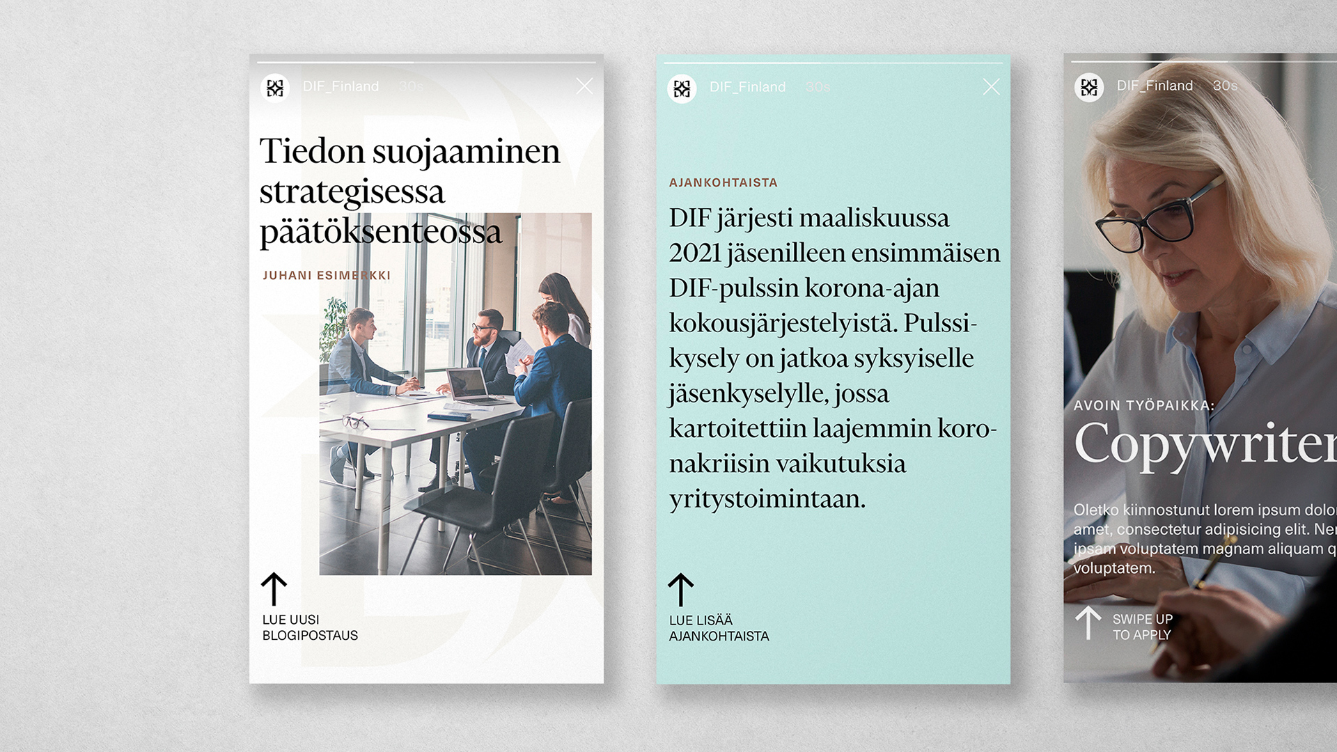
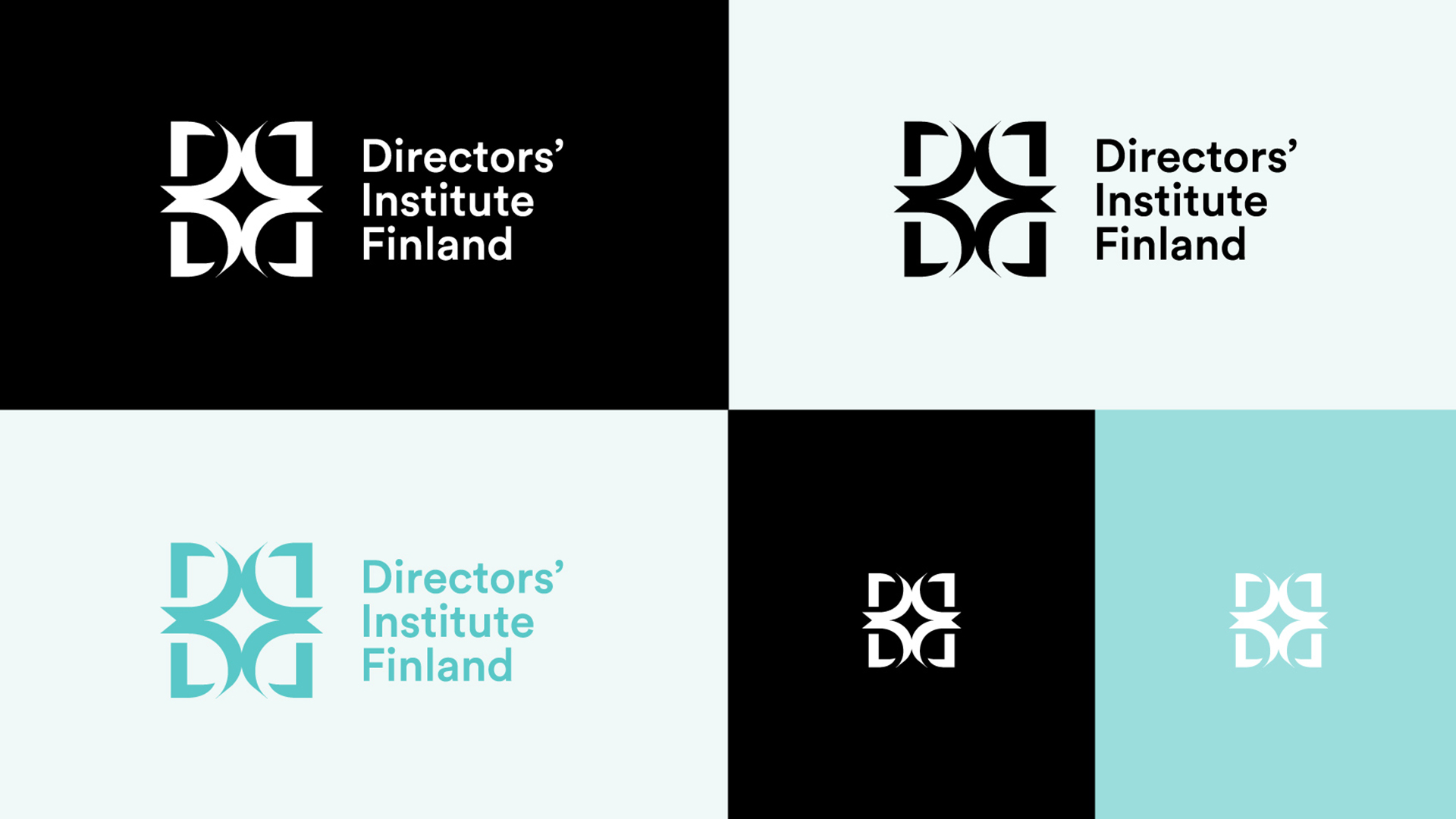
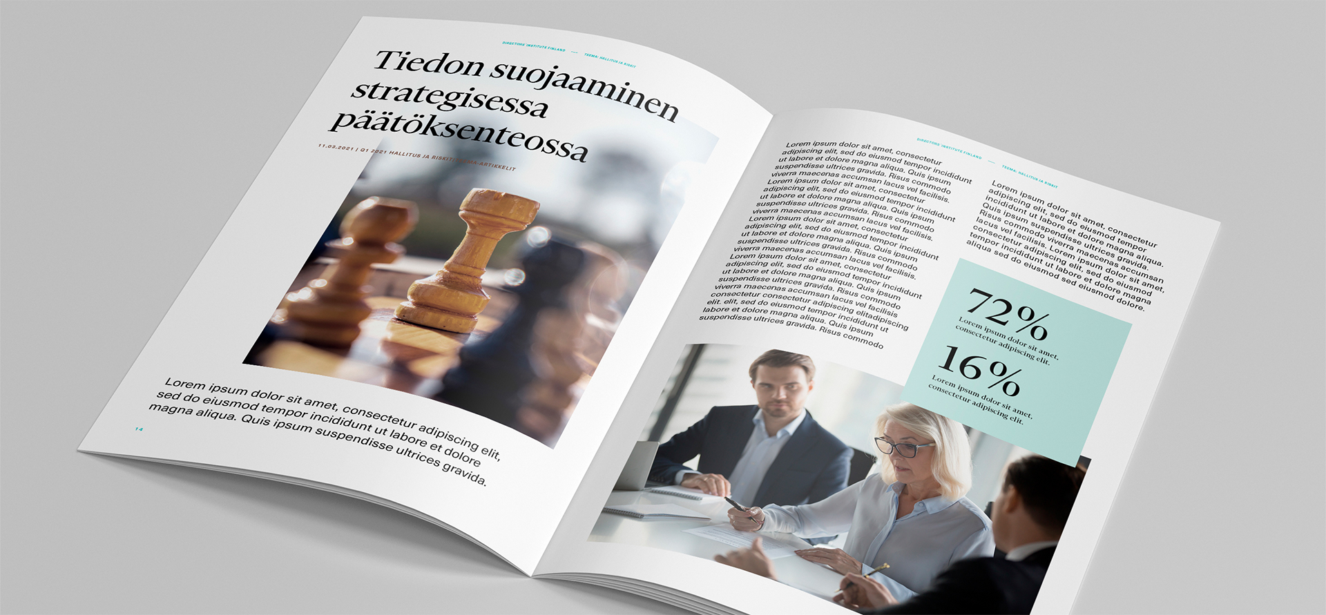
For DIF we created a new brand identity with a new logo, typography, icons and updated their old color scheme. The logo consists of four D’s facing each other, as members of DIF do while networking and otherwise working together.
CLIENT: DIRECTORS’ INSTITUTE FINLAND
VISUAL IDENTITY
STUDIO: RED&BLUE
YEAR: 2021